Selected Work
A glimse into a few of my favorite projects over the years.
Full case studies available upon request.
UI Goodies
2026
Built and maintained a widely recognized design resource platform, balancing product thinking, curation, branding, and long-term evolution over many years.
Design Resource Directory
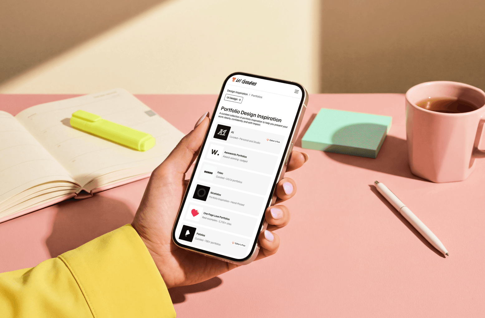
UI Goodies is a curated platform that helps designers discover high-quality tools, resources, and inspiration across UI, UX, branding, typography, illustration, icons, AI, and more. I’ve run this personal project since 2018 and recently led a significant redesign and repositioning, evolving UI Goodies from a simple directory into a more editorial, taste-driven resource for the design community.
I designed and built the new site from the ground up in Framer.
Problem. Most design resource directories focus on quantity and scale rather than quality, resulting in crowded lists with little curation or personality. I wanted to reinvent UI Goodies to create something more intentional: a platform that’s inspiring to browse, genuinely useful, and reflects a strong point of view on craft and creativity.
Approach. I reimagined both the brand and user experience, redesigning the information architecture, visual system, and discovery flow. I focused on thoughtful curation, structure, and atmosphere, using layout, typography, and pacing to make discovery engaging. I also refined the platform’s positioning, content strategy, and SEO to support long-term growth.
Outcome. The redesign transformed UI Goodies from a basic directory into a distinctive, immersive product with a clear editorial voice. The new experience encourages exploration, highlights craft, and gives the platform a unique identity in the design community, while setting it up for future growth and expansion.


Tooling
2026
Designed, built, and actively use a focused outreach management tool, blending rapid prototyping, visual design exploration, and hands-on development to create a simple, personal solution, purpose-built for my needs.
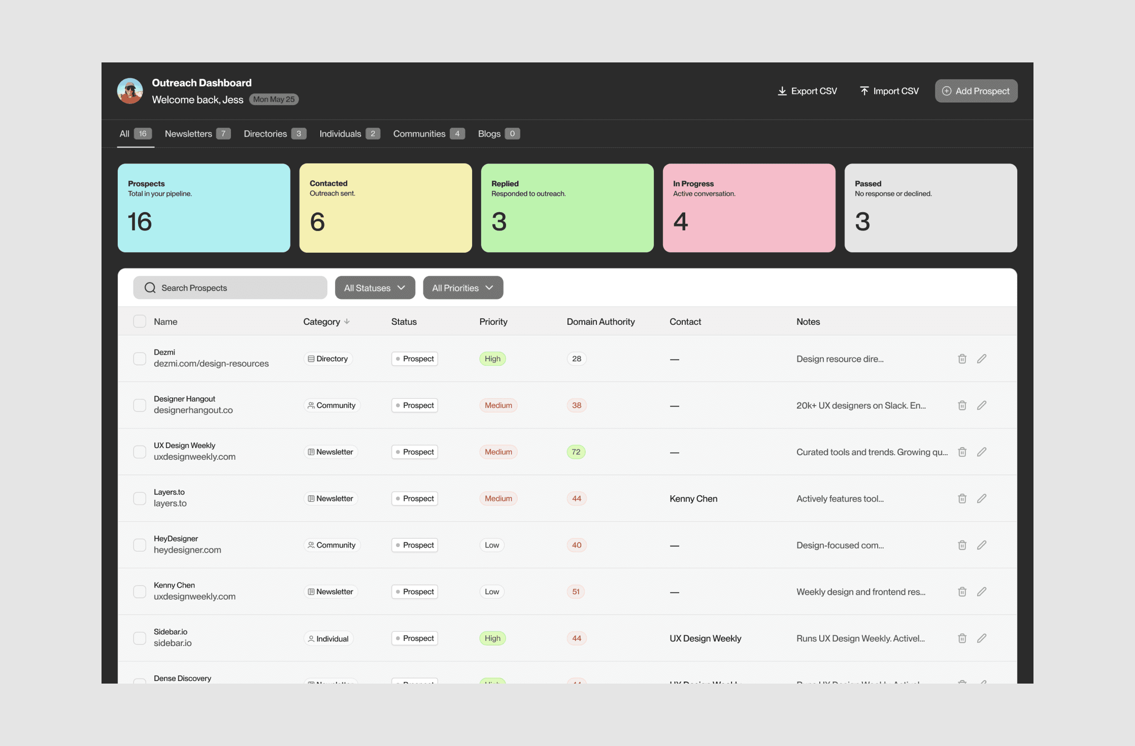
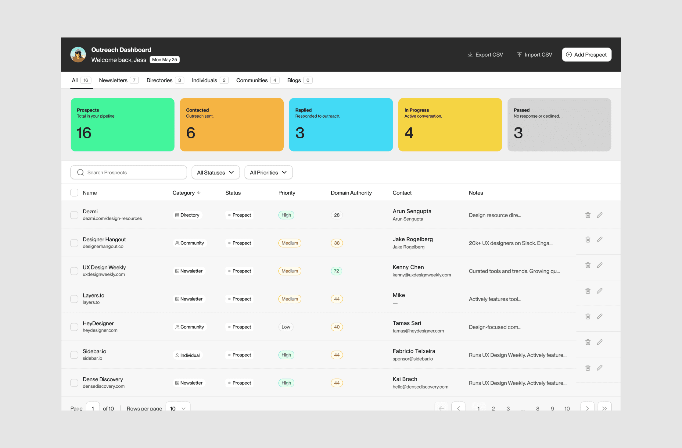
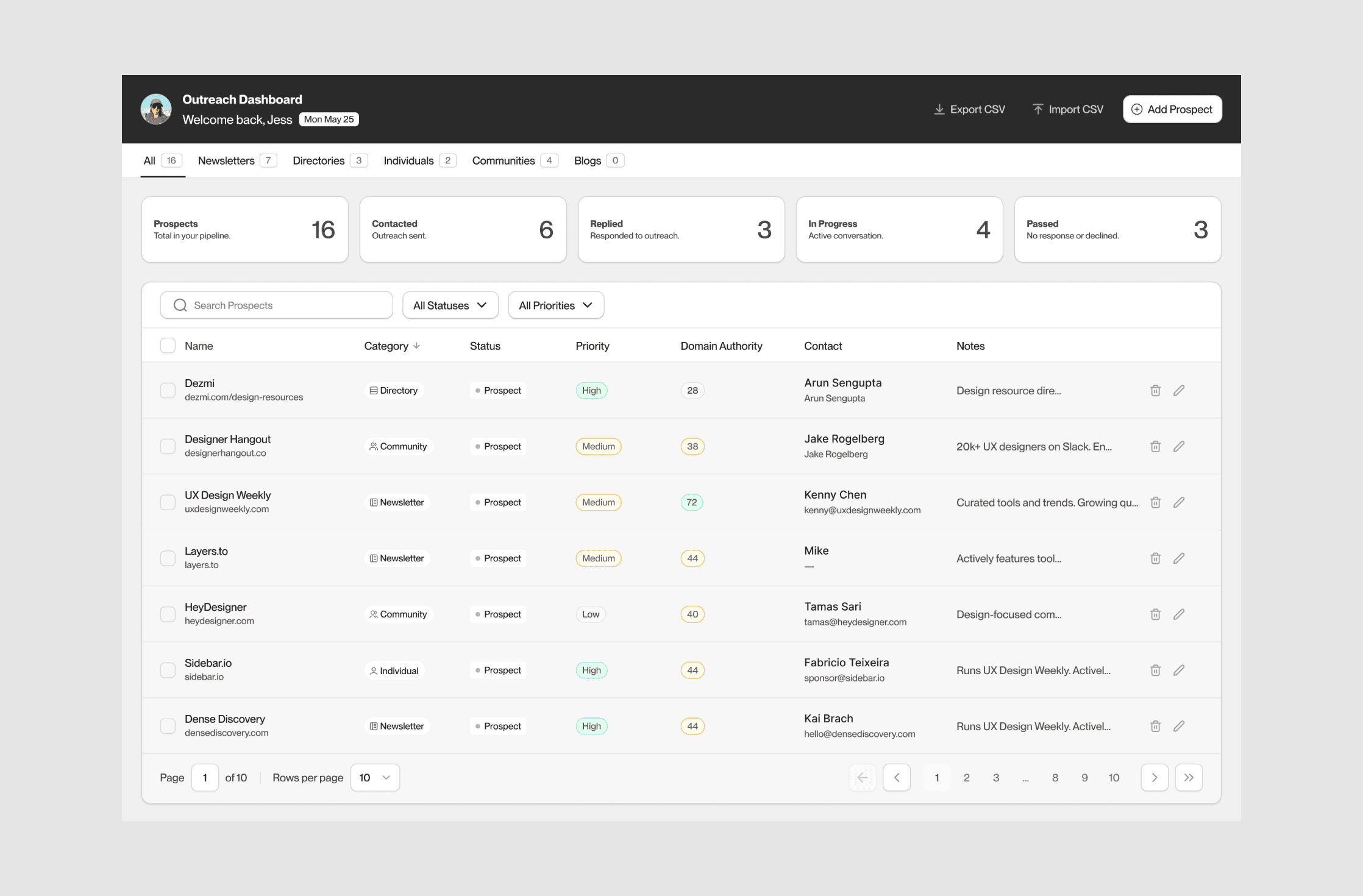
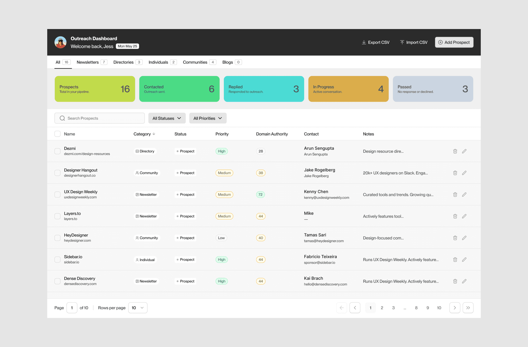
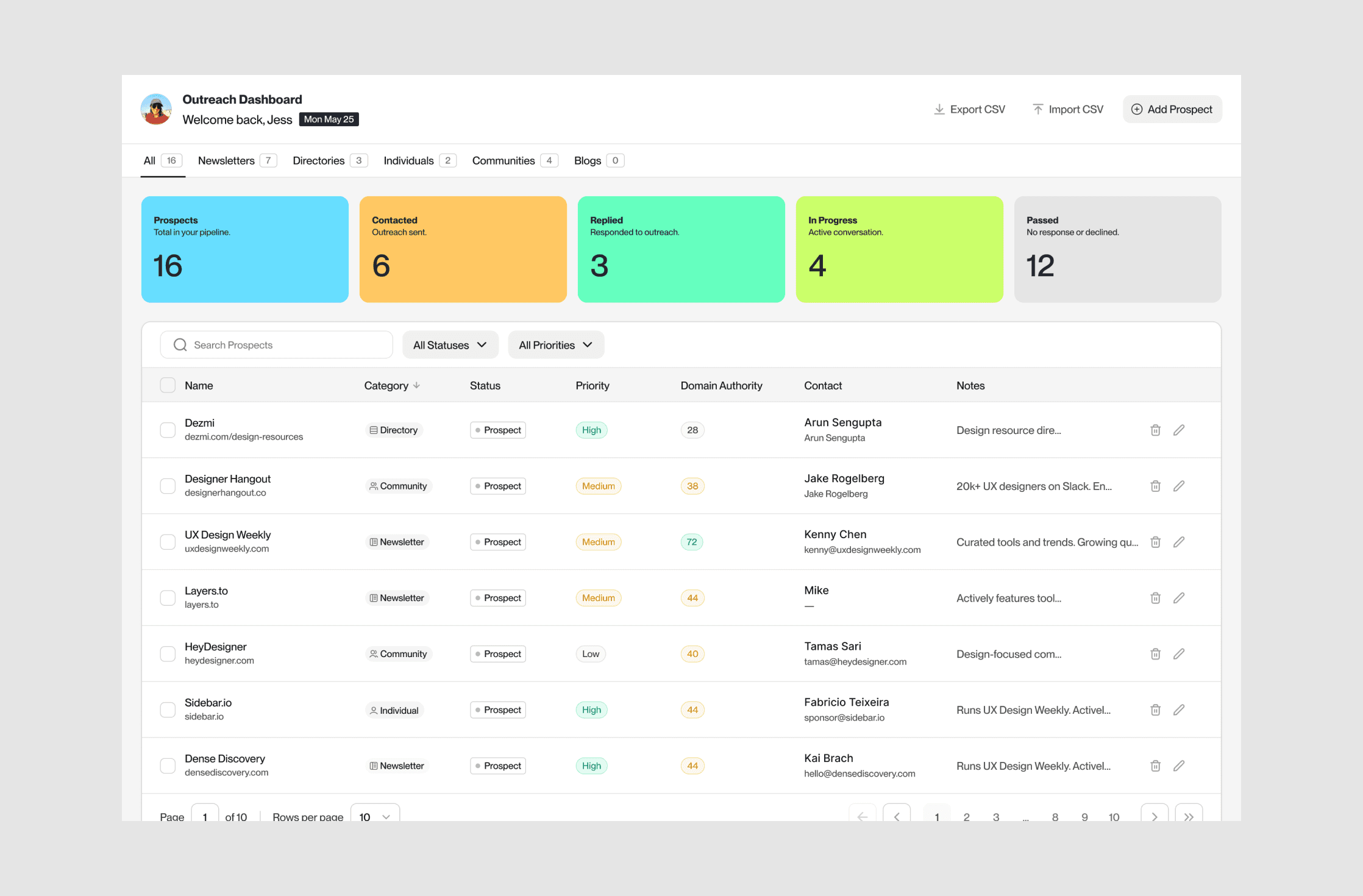
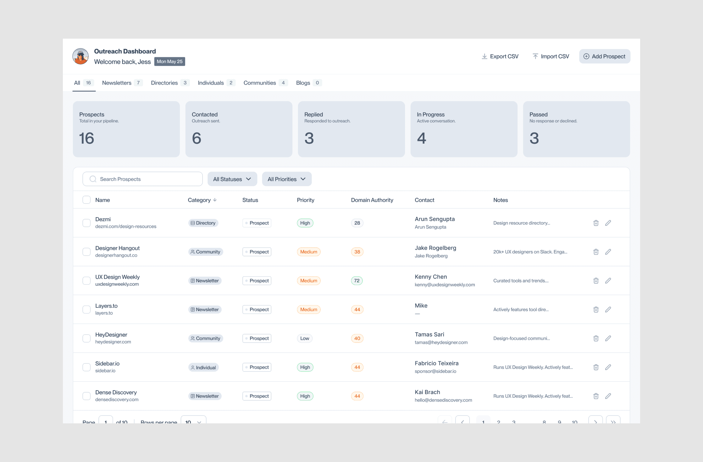
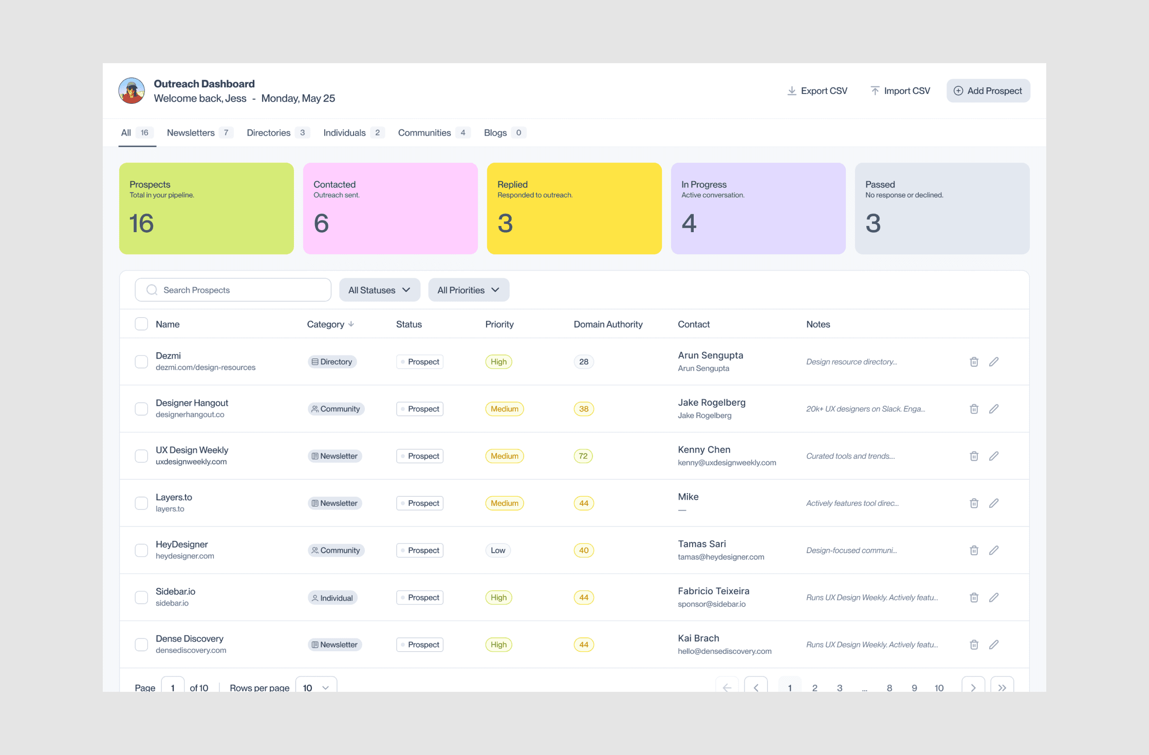
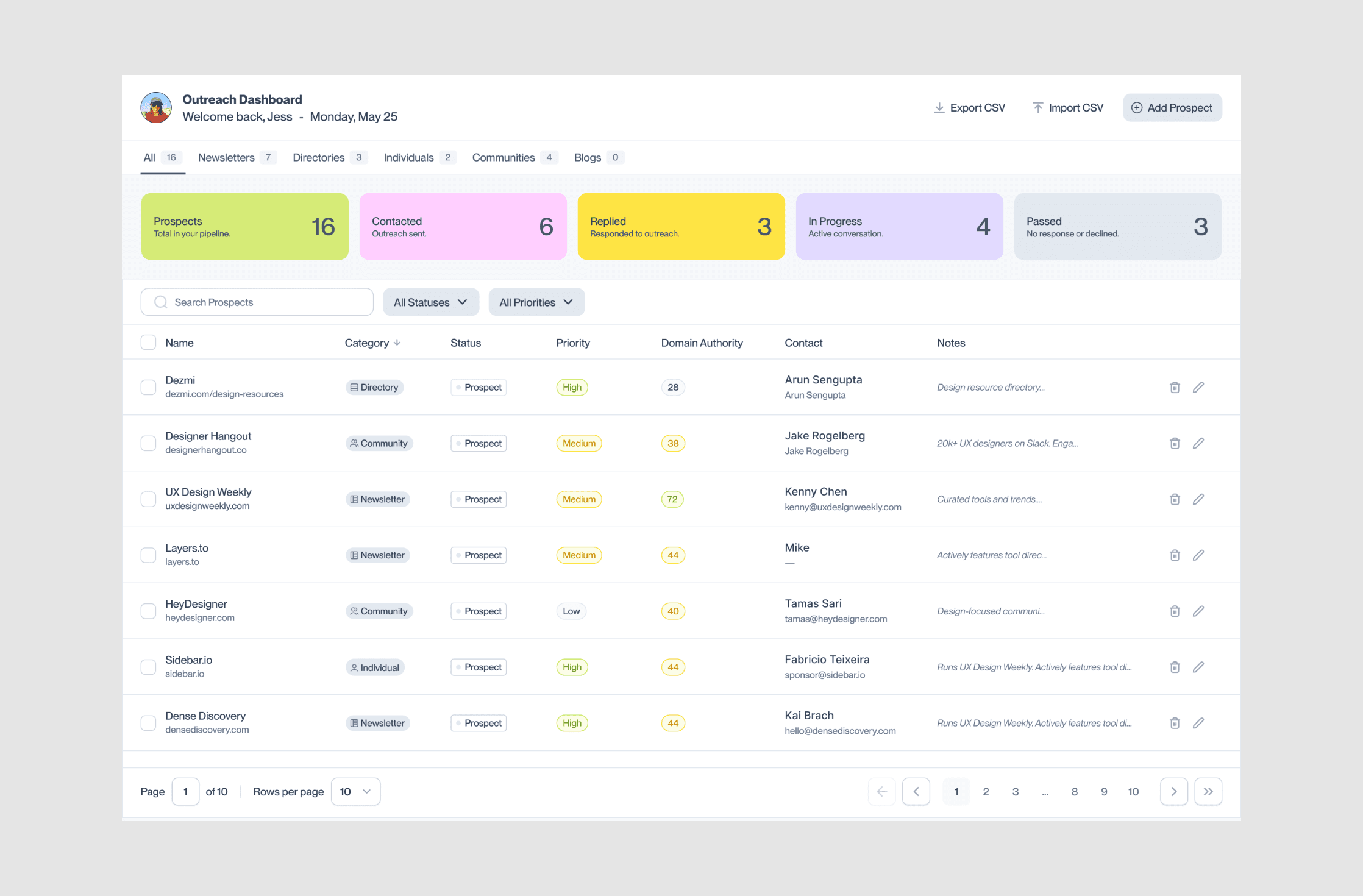
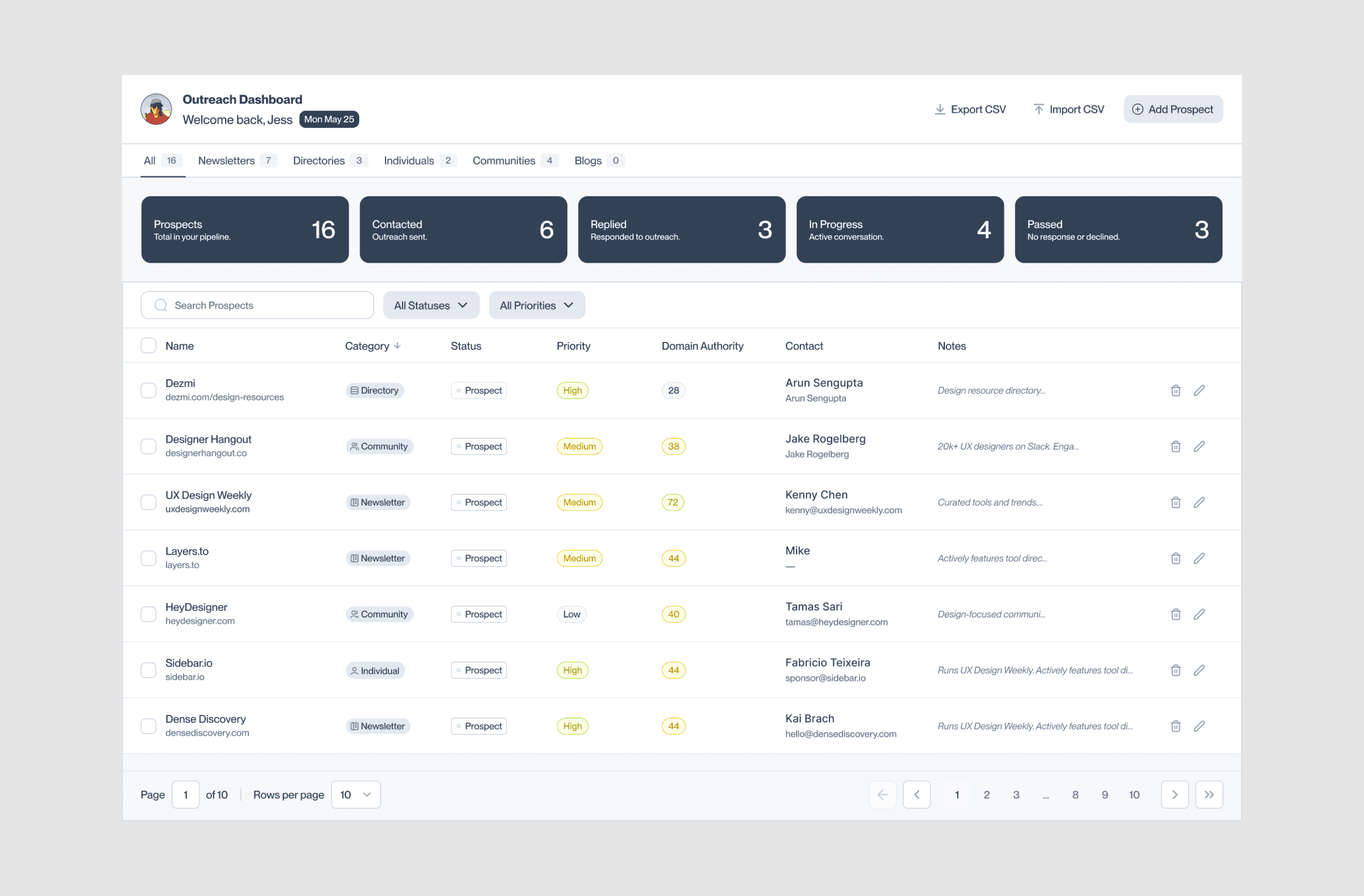
Outreach Dashboard
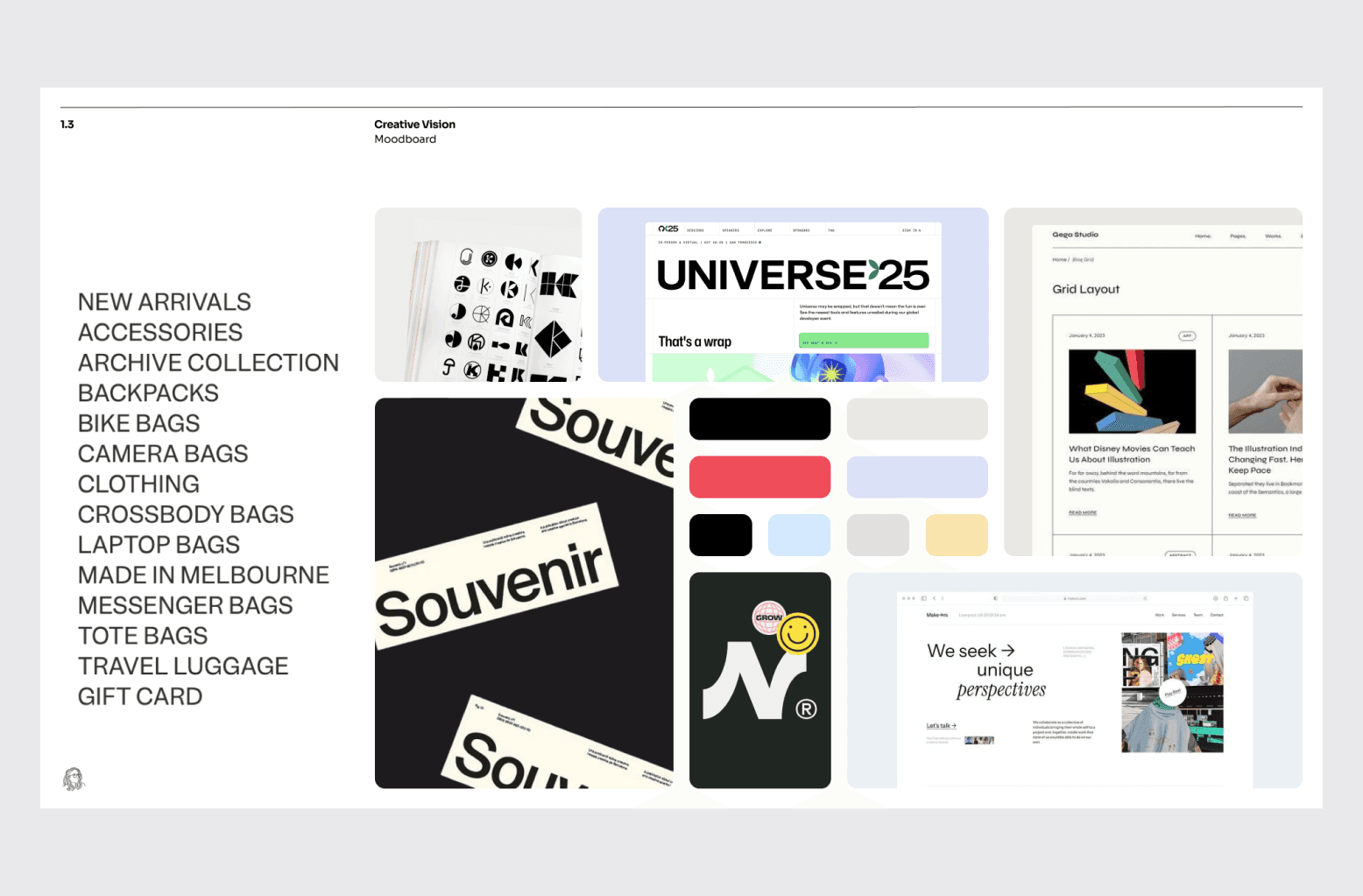
Outreach Dashboard is a personal tool I built to streamline link-building outreach for UI Goodies. It organizes prospects in a simple visual pipeline tailored to how I work, more intuitive and effective than a spreadsheet. I created and refined it through prototyping, design, and end-to-end development in Claude Code.
Problem. Doing outreach for UI Goodies meant juggling spreadsheets, browser tabs, and half-organized notes. Nothing showed me the pipeline at a glance, and existing CRMs were either too heavy or built for sales teams rather than content outreach. I wanted something simple, visual, and shaped around how I actually work.
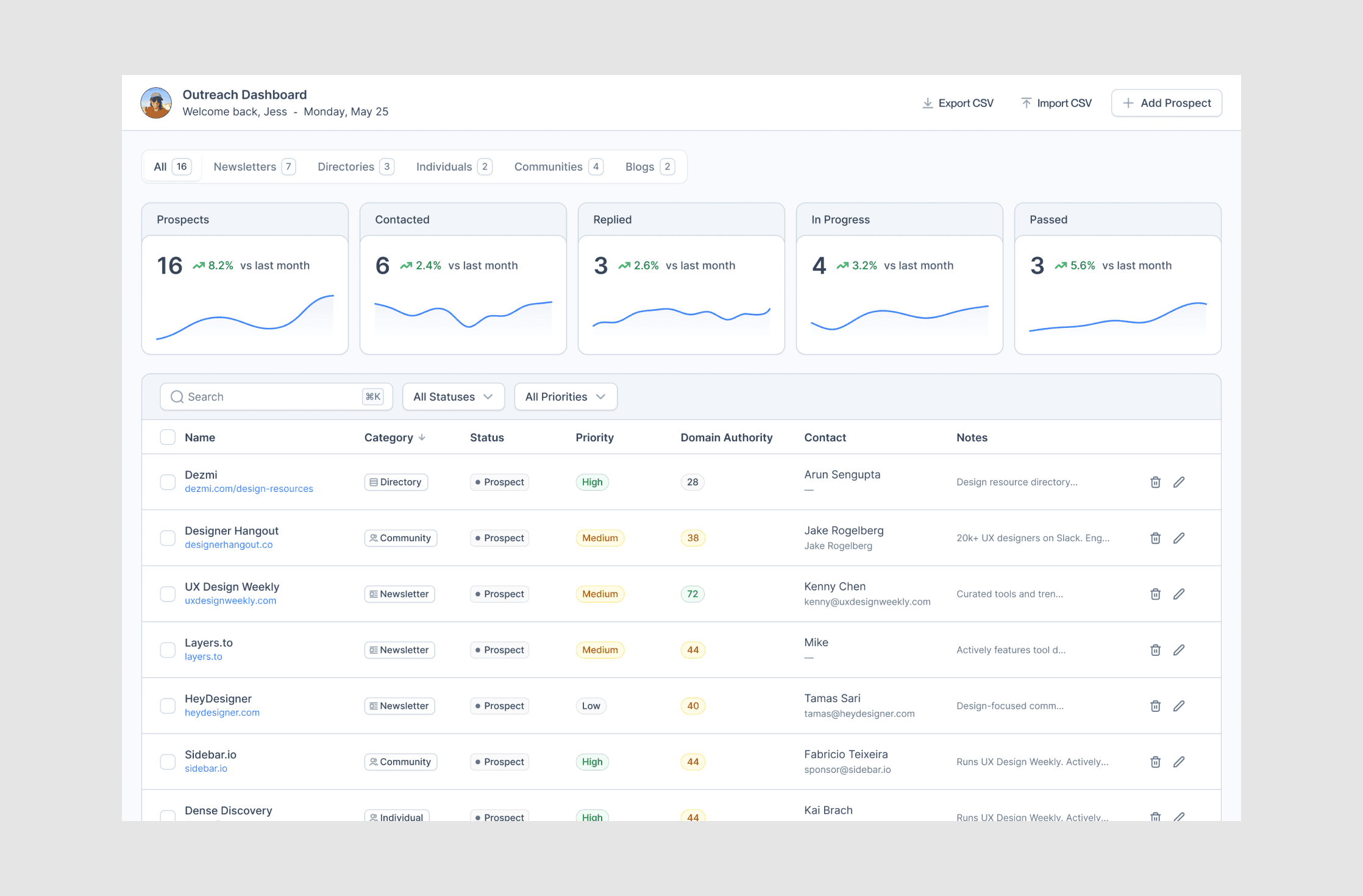
Approach. I started with a functional prototype that connected to Airtable to persist real data in the browser. Once the core loop worked, I explored several visual directions (shown here), then selected and developed one into the final product.
Outcome. A practical tool I use for my own outreach, this project brings together several practices I enjoy: vibe coding with AI, product thinking, and visual exploration. Though intentionally limited in scope, I followed a clear workflow, proof of concept, design, and then full development.
Zendesk
2025
Led product design for a major workflow automation initiative, helping align product, design, and engineering teams from early concept through MVP launch.
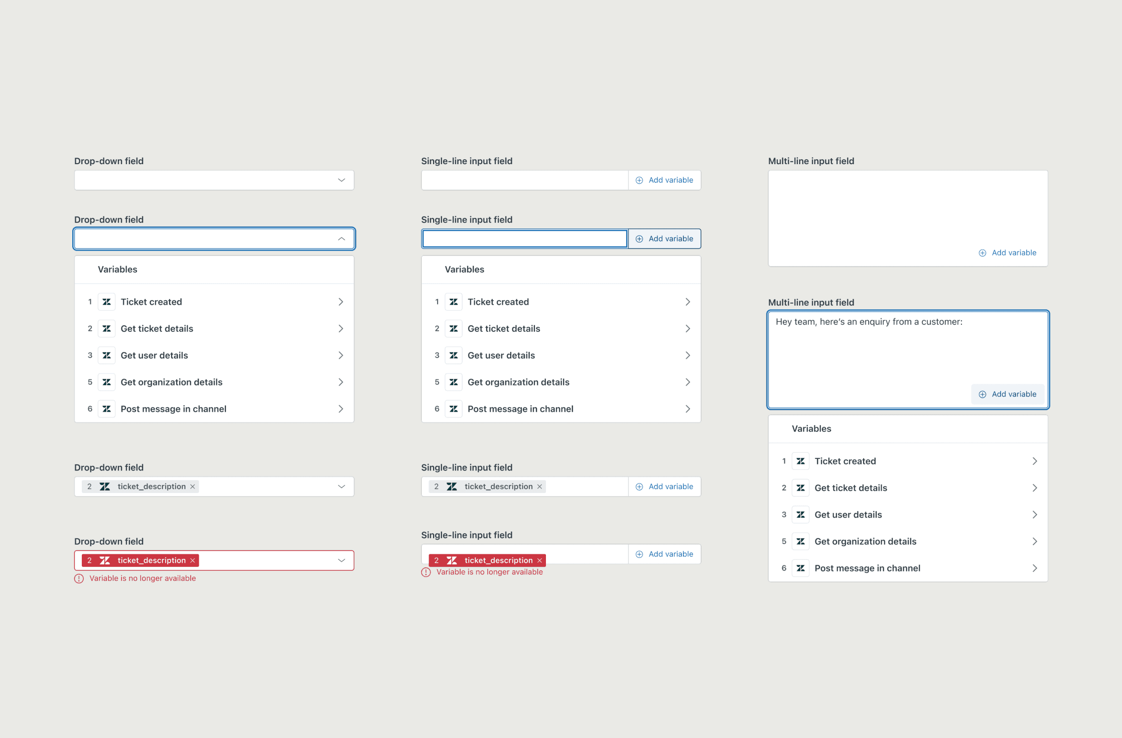
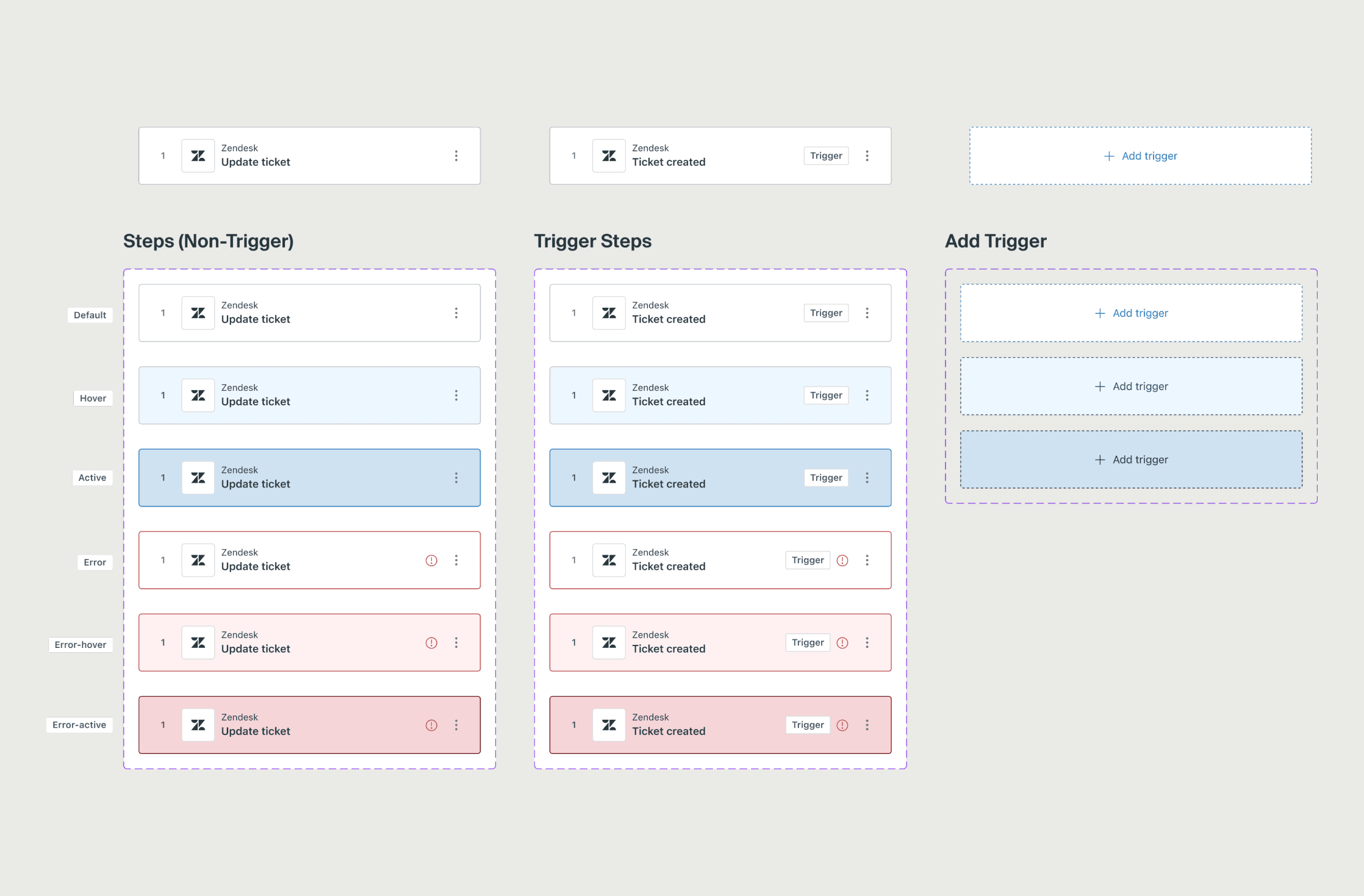
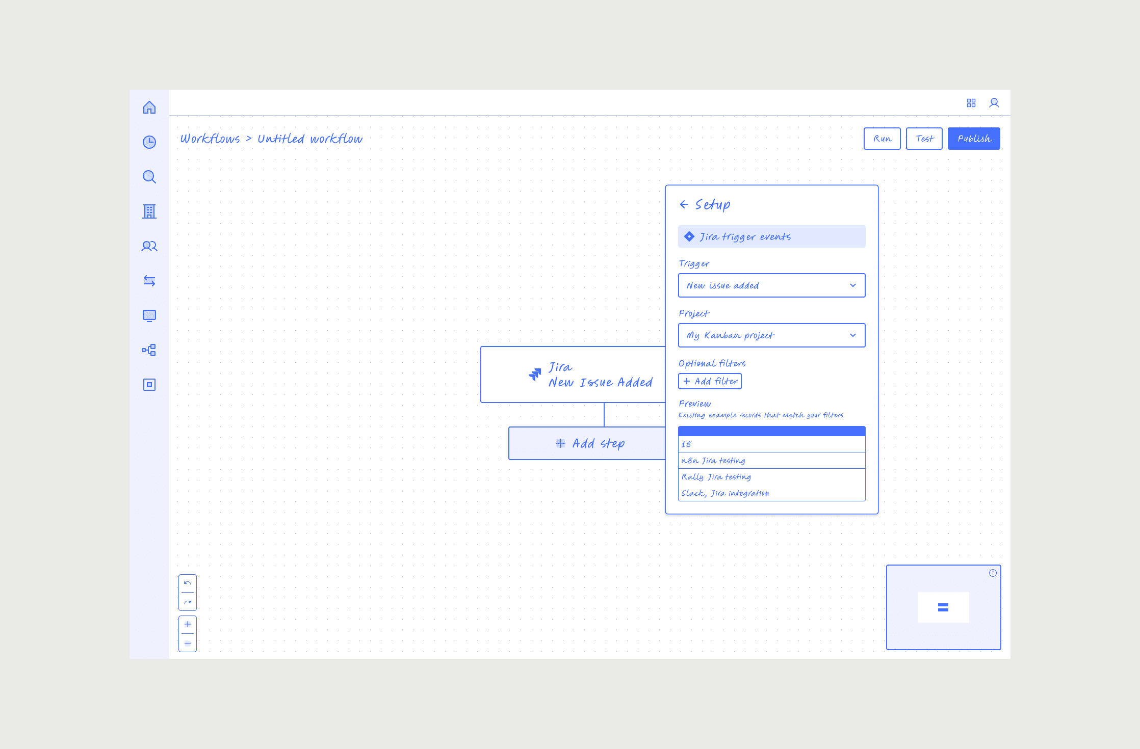
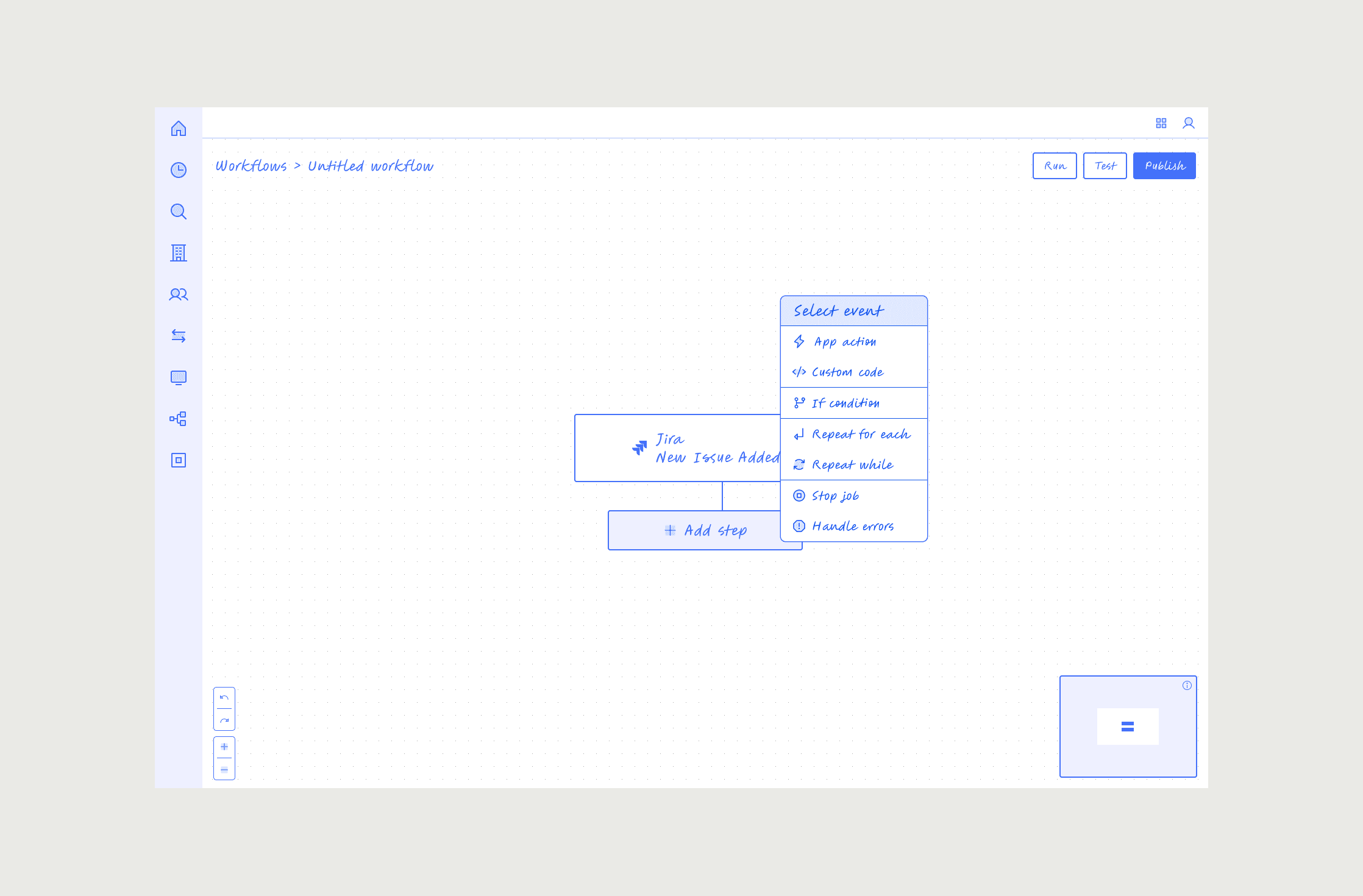
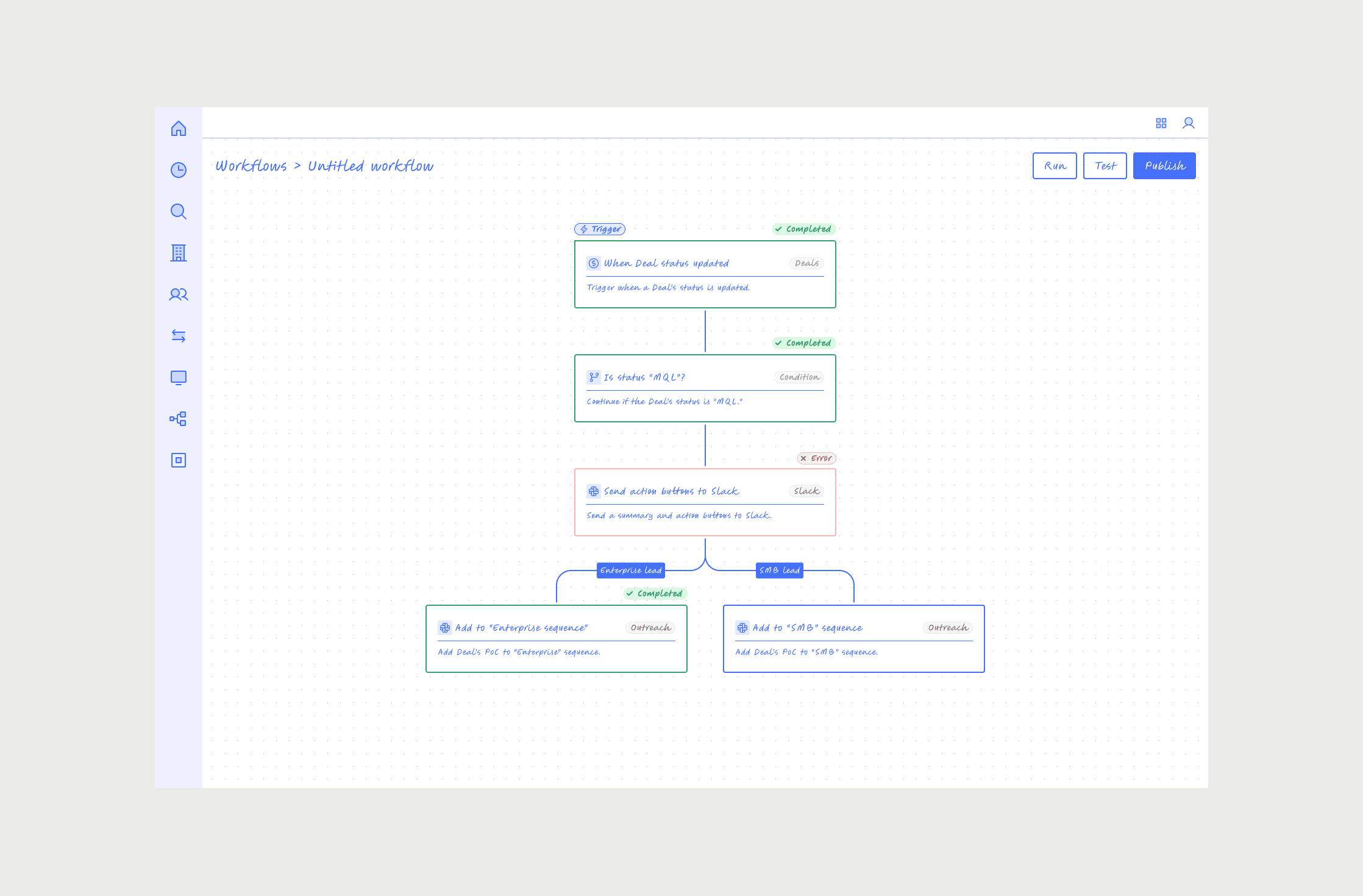
Action Builder
Action Builder is a no-code workflow automation tool that lets Zendesk Admins automate complex processes without needing engineers or third-party tools. I led product design from initial concept through MVP launch, helping take the product from idea to working software in just 77 days.
Problem. Zendesk Admins lacked a simple, powerful way to build automations directly in the platform. The challenge was to design a flexible workflow system that could scale, while bringing a fast-growing, distributed team together around a shared vision and plan.
Approach. To get there, I introduced an early “scaffolding” approach to quickly map the experience, define key interaction patterns, and align product, design, and engineering. As the team grew from just a handful to over 40 people, I set up regular design–engineering syncs, async feedback, and shared docs to keep everyone moving together.
Outcome. Working closely with engineering and product leads, we iterated fast and shipped a production-ready MVP on a tight timeline. Action Builder became a major new automation initiative for Zendesk, validating strong customer demand through its Early Access Program. The product launched in 77 days and attracted 150+ customers to the EAP, laying the groundwork for Zendesk’s broader automation platform.
See my scaffolding process.
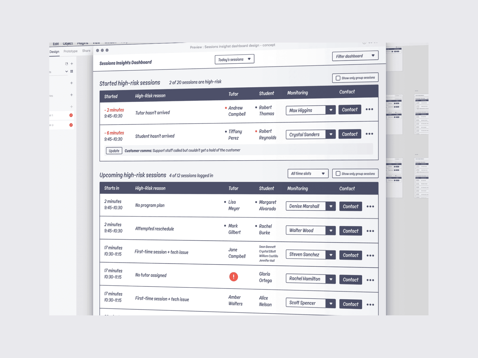
I sometimes use a process called scaffolding when designing new products and features. This approach lets me quickly map out an entire product or feature using high-fidelity blueprint wireframes, which helps clarify product thinking early in the process. Because scaffolding isn’t focused on visual design, it enables rapid iteration.Providing the team with something tangible to review fosters valuable product discussions much earlier.


Cluey Learning
2020
Led product design for an internal support platform, helping customer support teams manage growing operational complexity at scale.
*I was the Founding Product Designer at Cluey and helped lead the creation of a personalized online tutoring platform for years 3–12, covering Maths, English, and Chemistry.
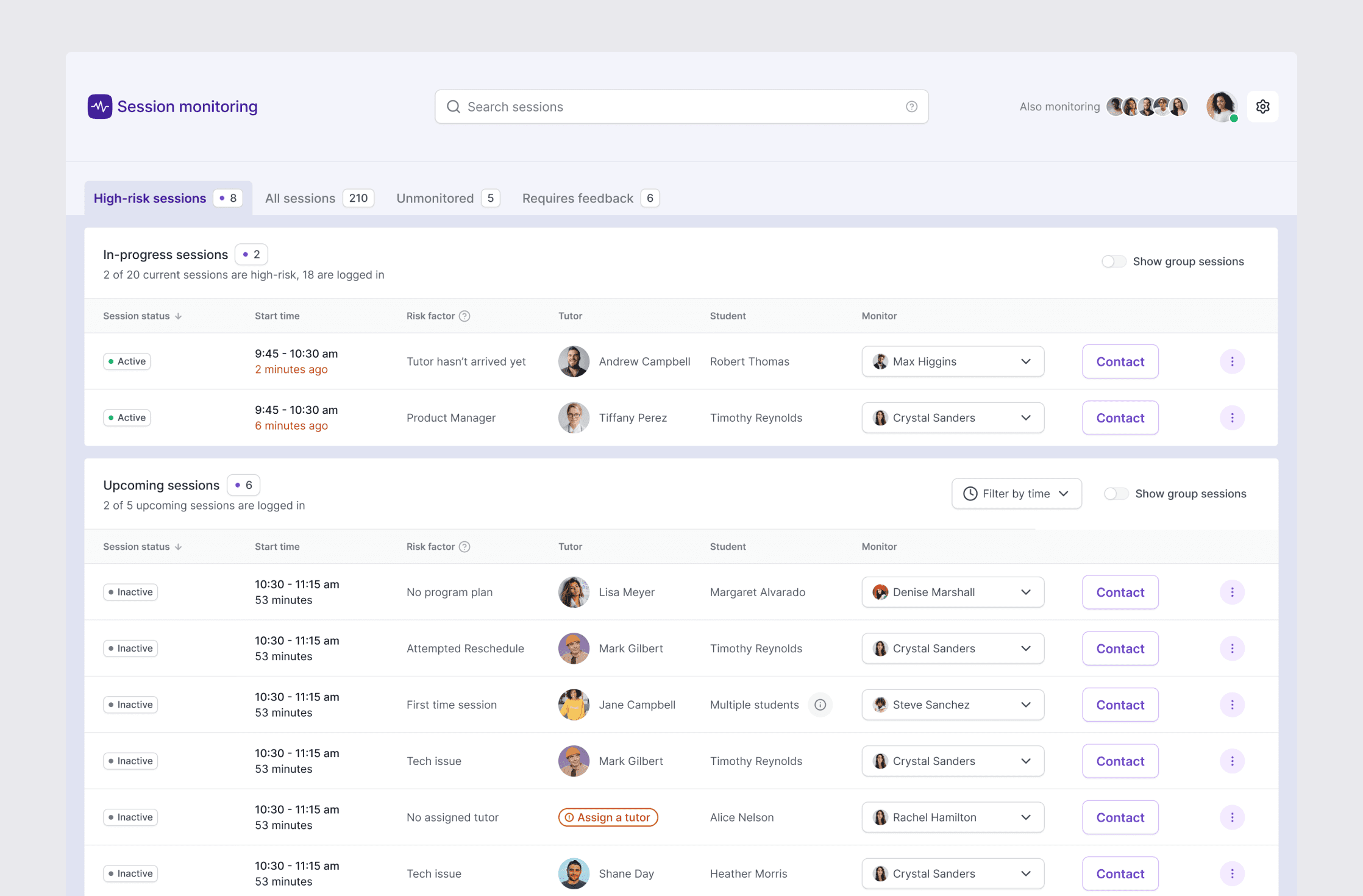
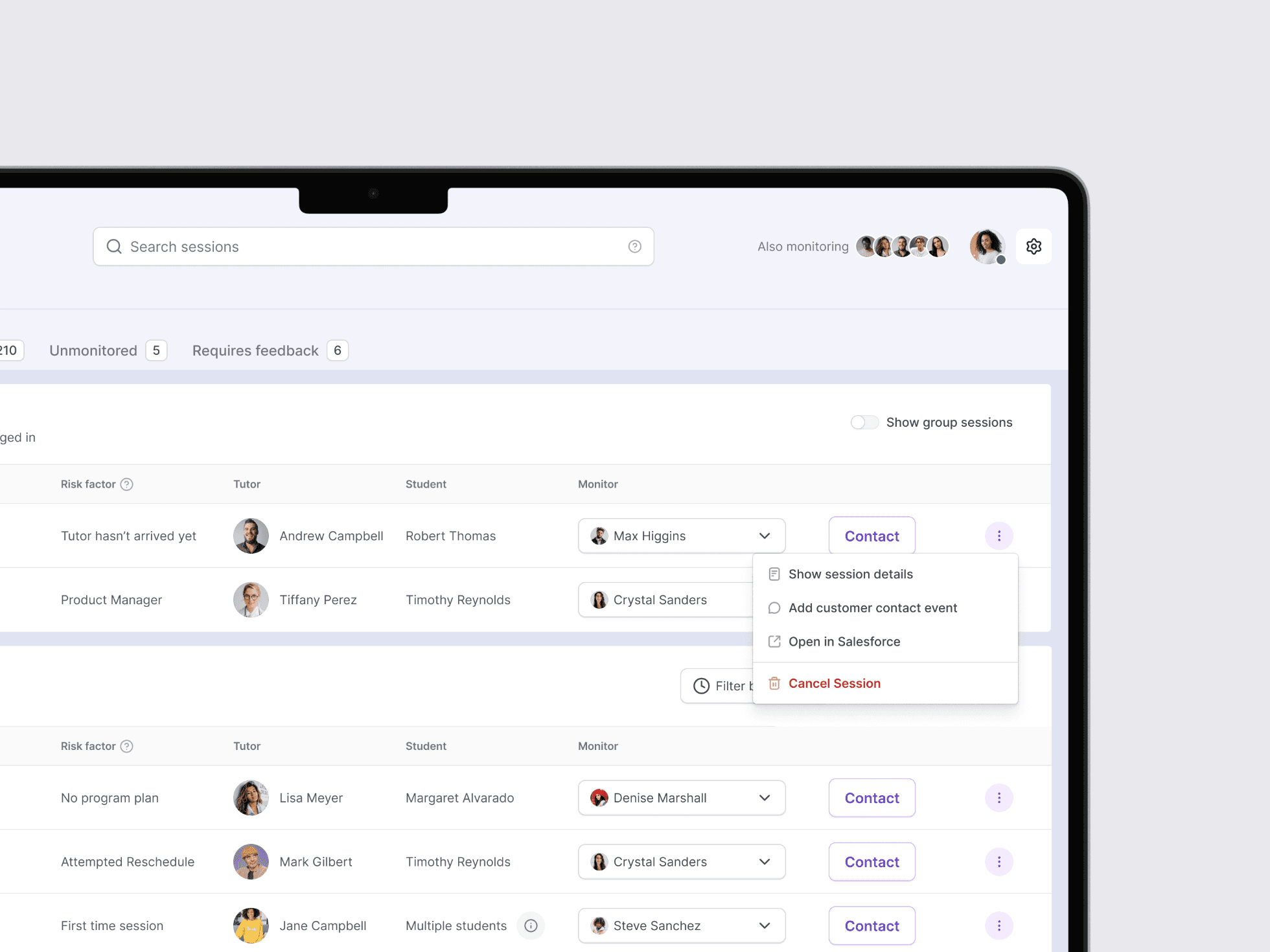
Session Monitoring System
Cluey Learning is an Australian EdTech company offering remote tutoring for years 2–12. As the company grew, manual session management became unsustainable. I led the design of a new Session Monitoring Platform, built from scratch to support the team at scale.
Problem: The Session Management Team was manually managing an increasing number of tutoring sessions, making it hard to respond quickly when something went wrong, whether it was a missed tutor join, a tech issue, or a student needing urgent help. It was impacting our customer service.
Approach: I worked closely with Customer Care and Engineering to rethink the platform from the ground up. We started with structured discovery and collaborative audits, then moved quickly through rounds of design and prototyping, always focused on what the team actually needed.
Outcome: The result was a purpose-built platform that gave the team better visibility, clarity, and control during live sessions. Urgent issues were easier to spot, histories were easy to check, and the right actions were just a click away. After launch, outbound follow-up calls dropped by 50%, staffing and operational costs went down 5%, and the team became much better at proactively managing high-risk sessions.