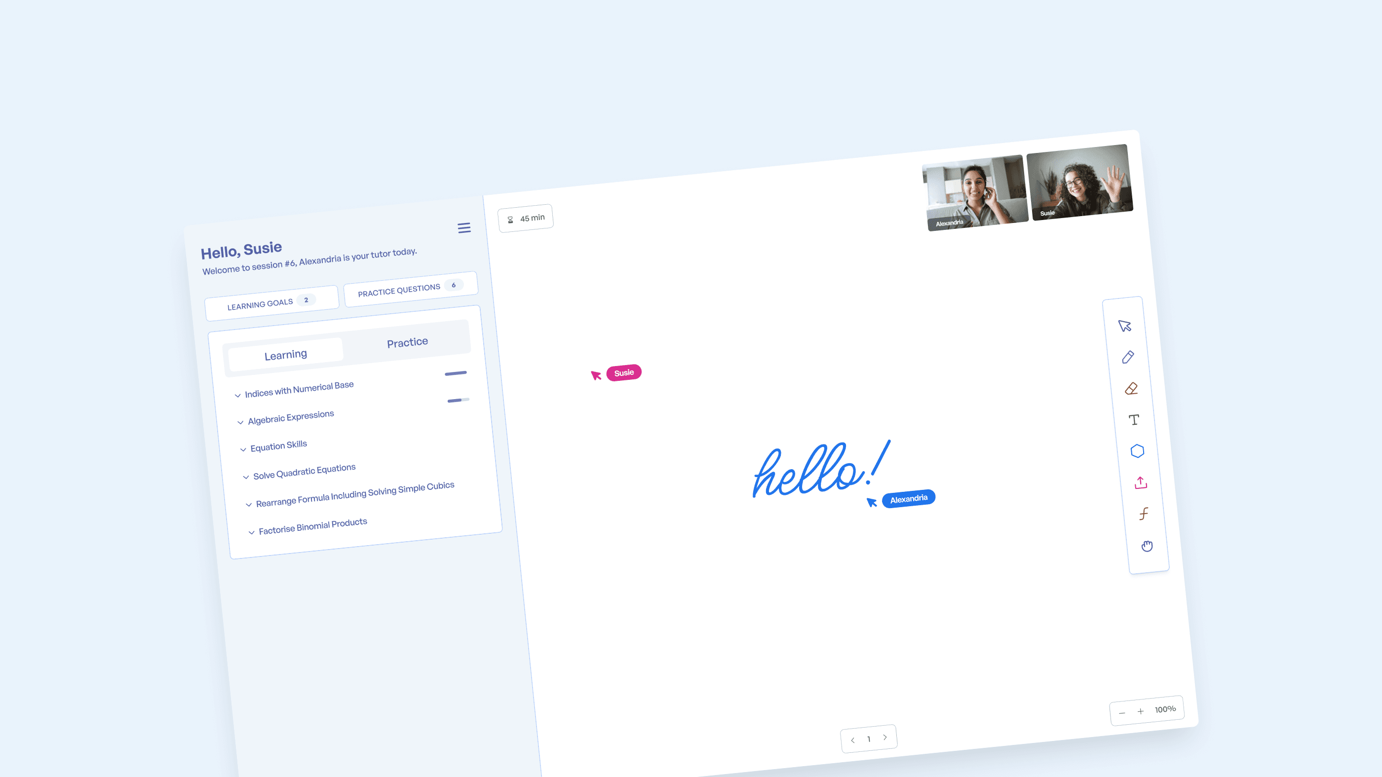
With a small product team, I spearheaded the design of a personalized tutoring platform that helps students in years 3-12 improve their Maths, English, and Chemistry skills. As the sole product designer at Cluey Learning, I collaborated with a small, agile team to bring our vision to life.
My role
Lead/Founding Product Designer
The team
2 × product manager
1 × product designer
3 × engineers
Year
2017-2020
(6 months to MVP)
Discovery & Definition
I joined Cluey as one of the first hires and the only design lead. This new company aimed to develop an online learning space that fosters student and tutor collaboration and provides personalized educational content; this platform would facilitate 45-minute tutoring sessions conducted virtually.
We conducted rigorous discovery activities to refine the idea and ensure its viability, including daily discussions on the product’s core features and user engagement strategies.
Identifying a core feature set
Simulating a learning environment
Next, we created a series of online learning scenarios to simulate a real learning experience. Through this process, we gained valuable insights that we could incorporate into our design process.
I explored how we might present the product’s functionality and features by experimenting with grouping and designing workspace layouts in a blueprint wireframe style using my approach, “designing the workspace first.” This approach enabled fast progress and facilitated team discussions.
Development & Delivery
Through mock tutoring sessions, we identified critical functional and environmental needs. We understood that any time spent figuring out how to use tools or find information took time away from the learning session; our goal was to maximize learning time.
Learnings
It was essential for tutors to access the right content quickly. To facilitate this, we incorporated features that allowed tutors to view and skip content easily.
Additionally, we maximized the workspace for small screens by utilizing sidebars to open and close sections and content.
I designed interactions that automatically minimized views when adding educational content to the workspace.
As we continued to iterate from concept to vision, I utilized a blueprint wireframe-style presentation to help the team focus on the contents of the presentation layer. This approach allowed us to refine the design and clarify our vision as we learned more about our product.
High-fidelity prototyping
As the design process progressed and our product vision solidified, I transitioned into high-fidelity designs and more prototyping. During this stage, I utilized my skills to develop a functional prototype showcasing the product's key features and user experience; this allowed us to understand better how the product would function in real-life scenarios and identify any potential areas of improvement.
The homestretch
As we gained more confidence in our final approach, we shifted from design and prototyping to development to create a complete product experience, including engineering design. During this time, we made a fully-functional application that we rigorously tested over several weeks before shipping; the focus shifted to refining interactions and usability, which we did in code.
A significant challenge during this project was designing a UI to cater to all age groups, grade levels, and tutors. To overcome this, I focused on developing a clear and concise interface with easy-to-understand interactions and symbols, aiming to create an interface that was easy to intuit and required minimal training for all users.
After several weeks of testing, we launched a working application that exceeded our expectations. Our platform has helped thousands of students improve their academic performance and gain confidence in their abilities.


